Top 6: Wallcovering + Technology

I had intended to post this link ages ago and it got lost in my sea of bookmarks.  Although it is months later, these wall coverings are no less remarkable. If you are interested in seeing the future of wall covering, check out Design Boom's Creative and Unusual Wall Coverings and Wallpaper Designs.

There are some unusual and thought provoking patterns.  However, I love products that encourage occupants to interact with their environment, so my favorites from Design Boom's selection are the ones that are influenced by Science and Technology. These wallcoverings are unlike anything you have seen before; they glow in the dark, they are alive, they are react to heat or sound, they are animated. On the downside, I would guess that most of these are still in the prototype phase or one time installations....


Top Six Innovative Wall Coverings
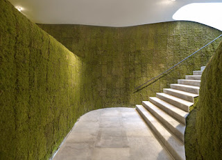

1. iiiiiit's alive!  
I saw this in Contract Magazine or Interior Design Magazine last year.  This Living Green wall covering was used in the inteiror and exterior of Ann Demeulemeester's  store in Seoul, Korea by Mass Studies Architects (also in Seoul, Korea).
2. Afterglow
Glow in the dark paint isn't a new idea. You've probably had glow in the dark stars on your bedroom ceiling at some point in your life and and you've probably seen the safety photoluminescent egress path markers that have been out for a few years. Phosphowall is a bit more sophisticated, by using special phosphorescent ink, this wallpaper glows when the lights are turned off.  Designed by Ich & Kar, France.

Free CEU: The 5 Levels of Gypsum Board Finishing


While surfing around for Impact Resistant Wall Construction the other day, I found a great free (!) CEU explaining the levels of gypsum board finishes and when to specify it.

Register.
If you haven't created an account with Ron Blank and Associates, you should. This is a great resource for all sorts of free online CEUs. Most are worth AIA credits. There is NO CHARGE and when you register it also includes a membership to GreenCE.com which has a few free (hard to find!!!) LEED CEU's!

Watch.
The 5 Levels of Finishing Gypsum Wallboard.  The online course is hosted by Ron Blank & Associates and sponsored by National Gypsum Company.  
The learning objective are:
1. Explain what gypsum is
2. Understand the fire resistance of gypsum
3. Determine the levels of finish
4. Understand industry terminology
5. Know when to specify level: 0, 1, 2, 3, 4, or 5

The course closes with a quick 10 question quiz (multiple choice and true/false). You must answer at least 80% correct to receive a certificate of completion.

How easy is that?

If you are not interested in a certificate but are interested in the basics read on for a quick rundown:
 

What's Behind Door #2?

Who isn't intrigued by the idea of having a secret door? Grensgeval, created by Dutch designer Lotty Lindeman in 2006, is a "secret door."  I use quotes because it doesn't exactly blend seamlessly into the surroundings and has a much more modern spin than the push latch bookcases you would read about in a Nancy Drew book.  Found via Dornob.
The door is flush with the surrounding walls when closed. Typical doors can only swing only one way because the hinge is located either on the left or the right.  This door has what I will call "articulating header hinges" which allow the door can swing in or out of the room AND left or right.  The articulating header hinges also allow the door to act as a partition or space divider or as a hidden walk way when fully extended.

Oh my Blog!

Yay! U-verse installed and I will spare you all the drama. But the great news is that Design Elixir is up and running again.  Sorry for the long delays and sporadic posting before/ during/ and after the move.

It's been a while, but I still have plenty of inspiring products, spaces, and firms to share with you.  In addition to sharing my study efforts for the NCIDQ.  One of my readers requested a tutorial on how to render in Photoshop,  hope to have that up by mid-August.  Although my blog is mostly focused on commercial interior design, I may post some residential projects and doodles as I search for inspiration, interior and exterior, for the new home.

Also, don't be surprised if Design Elixir has a new look by the end of summer. I love the new Blogger templates and I am eager to update my blog's, once I figure out how to customize the templates.  You know how designers are, we have to customize everything.

Design Elixir will be back to it's regular programming this Monday. 

Paint Decks, 3d Animation & Sherwin Williams

Have you seen the latest commercials Buck created for Sherwin Williams?  If not, you absolutely have to see them.  Too cute and truly inspiring.


Packing, Moving, Unpacking: An AT&T Saga

Sorry for the lack of posts recently- I've been pretty busy as I recently moved. So my life has been fairly hectic and full of carboard boxes and packing tape lately.

I am STILL waiting for AT&T to come out and connect this fabulous thing they call "U-verse".  Suffice to say, since I do not have internet access at home, it makes it pretty difficult to blog.

Cross your fingers, they are supposed to come out next week and I can get back into my blogging groove.

In the mean time, please excuse my lack of posts- I will make it up to you soon!

A212: CAFE: Tokyo Baby Cafe, Aoyama, Tokyo by Nendo :

I love the muted color scheme and the use of scale used in the Tokyo Baby Cafe, in Aoyama, Tokyo by Nendo.  Finally, a restaurant just for parents and their children.


The cafe is designed for both the parents and the children.  The cafe is stocked with everything you need to entertain a child;  books and toys, and includes a playroom, private rooms and separate spaces for nursing and changing diapers. Wide aisles make it easy to move around with a stroller, and light switches and door handles are placed high up to keep children from using them.

The cafe is designed to be enjoyed by two very different sizes of users, 'parents' and 'small children', so the interior plays on this difference in scale. They also see the world through different eyes. Take a table: adults live their lives aware of tabletops, and the things placed on top of them.

But children see the table's underside. A table's legs can look like pillars, and the reverse of the tabletop is like a roof. The cafe's 'absolutely huge' and 'absolutely tiny' furnishings take advantage of these two perspectives, the adult's and the child's.

A nursing sofa becomes a playroom when blown up on a massive scale, and a diaper changing table when shrunk to minuscule proportions. Big windows pair with small ones, and big lightbulbs with small ones. The floorboards vary in size, and the undersides of tables, where parents eyes don't reach, hide pictures of parent and baby animals. In fact, 'parents and children' can be found all around the cafe, ready for their parent and child visitors.


Found via: A212: CAFE: Tokyo Baby Cafe, Aoyama, Tokyo by Nendo

Guest Blogger Introduction: Tim Roberts

Some may think contractors are "only the builders" and can not provide any design assistance, but I can't think of a better source for information and advice.  General Contractors have a lot of insight on what works and what does not.  As a designer, you have the vision and the contractor knows the means and methods to achieve your goal (& if the budget will allow it). Contractors are a wealth of knowledge for construction details and best practices. After all, they see hundreds (if not thousands) of projects designed by different architects and designers. 

It's important to understand the design/ construction process from the general contractor's point of view. And as a newbie designer, I want to learn from the mistakes other designers (and probably I) have made, so I can grow to become a better designer and team member.  And who is better to ask about common mistakes interior designers make than a general contractor? After all, they are the ones who have to build our crazy designs.

Design Elixir is happy to announce it's first guest post, featuring Tim Roberts, a Senior Project Manager at Buckingham Construction Corporation (this is also his first blog post ever). Buckingham Companies is an Indiana-based real estate development, construction and management company encompassing Buckingham Realty and Development Corporation, Buckingham Management, LLC, and Buckingham Construction Corporation. 

As a Senior Project Manager, Tim is responsibility for overseeing and  managing all aspects of the construction process. Tim's experience with a wide variety of commercial construction projects includes large retail projects, industrial facilities, medical facilities, and offices.  He is also incredibly patient with newbie designers, like me.

I am thrilled to have him as my first guest blogger.  Please continue to the post below  or click this link, for Tim's "Top 10 Mistakes Interior Designers Make."

Top 10 Mistakes Interior Designers Make

“Every noble work is at first impossible." – Thomas Carlyle” is a great description that correctly illustrates the natural conflict that arises when you mesh together the creative soul – designer with the Type A personality – project manager in a space with lots of change, little time and never enough money! At the prodding of Design Elixir I am giving you my “list of mistakes” made by designers during my 27 years of construction management experience.
 10.  Timing. Projects have a variety of time-lines and often the timing of final selections hinder the progress of the project. Recognizing long lead time items from the beginning, like special flooring tiles, lighting, and items like artisan sinks, or items that may seem like a simple add but are labor intensive to complete – i.e. faux painting a wall, could make a very positive impact on the move in date.

9. Adding elements at the last minute. Some designer elements may need special plumbing or electrical connections or may change what has already been installed in the “rough in” stage of the project. Last minute changes can create a windfall of extras to the client and ultimately back up the project schedule.

8. Receiving “buy in” from the owner before presenting to contractors. I have experienced projects where a designer has introduced an element into a project that an owner just plain doesn’t want in their space or does not work with their perceived vision. This can delay the project and cost the owner/designer time and money.

7.  When working with an outside Architect, making sure the design elements work within the limitations of the building/space. The common use of exposed ceilings – when the structure is in design can help with design of steel support structures, placement of beams/columns/windows and doors.


6.  Designers need to include dimensions of their designs. Often we will see designs that do not include the proper dimensions or are not to correct scale and when applied in the field, mistakes are made or work has to re-done to match the intent of the designer.  {Design Elixir Recommends: Construction Drawings and Details for Interiors: Basic Skills }


5.  Designers need to be aware of local and national codes. We sometimes see designers want to include features that impact the 1 or 2 hour rated walls or want doors which are for emergency egress to be removed or moved. These changes create issues within the space meeting local/national codes. {Design Elixir Recommends: Building Codes Illustrated: A Guide to Understanding the 2009 International Building Code }
4.  ADA Requirements. Designers need to look at ADA requirements when looking at specialty items such as toilets, restroom sinks, grab bars, clearance in hallways and landings. Local/national codes have certain requirements that need to be met and adhered to.


3.  When making choices for flooring, designers needs to remember the function of the client. If they have heavy foot traffic like construction trades (retail, tile distributor, tools sales etc), it does not make sense to install wood flooring or light carpet. Some items make look great on the designer board but just don’t work for the owner in the long run.


2. Lighting can be a very critical item. Designers need to know the owners work habits, employee’s work habits and the orientation of the building. These can all have a huge impact on lighting design and layout.

And finally, the number one thing designers can do that will impact the project during the construction process….

1. Designers need to include the contractor in the process. Meetings with owners, designer’s architects and contractor can pay huge dividends for all. Include everyone in meetings as early in the process as possible. These can have substantial impact on budgets, time-lines

Guest Blogger: Tim Roberts, Buckingham Construction Company

Designer Crush: Guess Who???

Imagine that you designed one of the most well known, most recognized and the most visited memorial, before you graduated from college.  How would you deal with the pressure and expectation level for your next project?  Would you be doomed to crash and burn, like the young starlets of Hollywood, that burn brightly and explode into oblivion? How could you possibly take your second built project to the next level, when your first, far surpassed any existing project?

There is a designer who did just that (minus the crash and burn part). This designer won a public contest held for the design of the memorial and continues to burn bright. Here is the winning concept for the memorial. 


Can you guess what it is or who designer is?  Initially, its selection was controversial, but now it is one of our nations most visited memorials.

Click on the "Get the full Dose" link below to see the installation and to learn more about this designer's newest, AMAZING & INSPIRING project.

Not until I have my coffee....


In the spring and summer, I take my used coffee grounds and fertilize my plants with it.  I've never looked at them and thought, hmmm, if I melt down my creamer container & add some coffee grinds, I could make a cool countertop material. 

But the fellas @Re-worked did.  Reworked developed Curface, a 99% post-consumer recycled surfacing material composed of recycled coffee grounds and post-consumer plastic waste. Coffee ground waste from office, cafes and factories across the United Kingdom are gathered, cleaned and sterilized before being mixed and turned into sheet goods.

recipe
Here are the details on the material:
  • Standard sheet size is 2000mm by 1000mm (6.5' x 3.25') and available in 5 (.19"), 12 (.47"), 18 (.70") and 25mm (.98") thicknesses. 
  • Curface is comparable to composite wood boards, most woodwork tools can be used. (I'd verify the specific tools with the manufacturer before cutting.)  
  • Sheets have a matte pressed finish and should require no additional finishing. (No lacquer, no stains, no sealants = no added VOCs!)
  • Scratches can be sanded out with fine grit sand paper. 
  • Clean with a mild detergent and warm water, do not use any solvent cleaners.
  • Curface an not be exposed to excessive heat or boiling water. This will cause the material to melt and burn.
  • Visit this link to see the potential color range
  • Custom colors available for large orders

Curface is brand spanking new. It was officially launched March 2010 at EcoBuild in London and they are currently working on a coffee shop installation in Milan. I'm jealous. Europe always has the coolest products.  All I can do is sit back and wait for Curface to come to the US.  I hope it will be approved for use in commercial applications.

Here are some images of Curface chairs Reworked has created with designer Nick Rawcliffe. The ash wood used for the legs and back came from an Ash tree that was cut down back 2005.  I have no idea how much it costs, but Adam and Nick will sign the first 50 chairs sold. And look, they made cute little bears from the left over Ash wood ( I want one!)


For more information:


I wonder how many cupppa joes it takes to make a 4x8 sheet. And I wonder if you could do the same thing with tea leaves....

Spring has sprung!

Sorry for not posting last week, but spring has officially sprung and I wanted to get out of the house and enjoy the beautiful weather.  It looks as though I am not the only one with spring fever,  I received a lovely email this week from Colour Lover's Color + Design Blog.  I loved the spring inspiration & colors so much, I thought I would share them with you.

Visit the link for the full post & subscribe to the Colour Lover's blog. You won't regret it!

Spring Color Love: Post Your Palettes

Photos shared by estatic (flickr). Photos link to originals.


Project Crush: Dobpler ınteractive Led Wall by Skjelvik Design

As an active partner of the European Capital of Culture Project, Sandnes Municipality (Sandnes, Norway) decided to develop projects that actively engage everyone, emphasized the most important qualities of the city, created visual changes in the city’s image, created sustainable values building and enhancing the identity of a fast-changing society and used light as the artistic medium presenting the young and modern city of Sandnes. 

The result was Watercolours a collection of eight light installations throughout the city. 

All eight light installations are amazing and inspirational. But I would have to say "Strømmer" (translates to Streams and Flows in English) made for Snøhetta Architects in cooperation with Prototyper AS and Rasmus Hildonenis  is my favorite because it engages the community and encourages people to interact with the architecture. Luminous "shadows" are created in response to movement. The shadows mirror the actions of the passerby; walking, jumping, dancing, or bicycling.  (See images below, courtesy credits: Skjelvik Design2008 | www.NullOhm.com  )


But it's not just a fun interactive wall.  It increases public safety. Sandnes' city center is divided in two by the railway line.  Streams and Flows is installed in a tunnel underneath the rail line and illuminates the walkway for pedestrians and traffic. It is also a testament to the energy saving benefits of L.E.D. technology.  The installation is composed of 27 square meters of LEDs provide light and the total energy consumption is smaller than 3 regular 60 watt light bulbs!  And LEDs have an amazing long life span!

Take a gander at this video of an adorable toddler interacting with the Dobpler Interactive L.E.D. wall.  This tyke is not alone, check out photo #8 to see child-like joy on the faces of adults interacting with the installation. If I ever see this installation in person, I would do the same thing.  Do you think you could resist the temptation?

If you like this project, check out these related links: 
Wishing Well (Part of the Watercolours project, but installed on the floor!)


Kinetic Light Emitting Wallpaper and Wall Panels

Dutch designer Jonas Samson is lighting the way for vertical surfaces.  He recently announced his newest addition to his product collection: a customizable, animated Light Emitting Wallpaper. (See product stills, below.  All images courtesy of Jonas Samson v.o.f.)


When I saw this product I had a million questions.  Gad Bros, business partner of Jonas Sampson v.o.f.,  was kind enough to answer all of them.  (Thanks Gad!)

Light Emitting Wallpaper is still in the prototype phase. The wall paper is not sold commercially and they expect it to take about 10-15years before there will be a material which will make it possibly to make an wall paper in this size for everybody. 

But don't be sad! Samson already produces a similar product Ecco Luce, a wall panel with integrated LED lights, that is currently on the market. Ecco Lucce is manufactured in The Netherlands, but available all over the world.  (See image, below) 


Ecco Luce is a single panel (120mm x 300 mm) and can be be combined with other Ecco Luce panels. Ecco Luce panels are about 5-6cm and studies are currently underway to reduce the panel thickness.
Panels are available in different finishes (glass, wallpaper, wood veneer), can be built with fire rated components, and can be placed attached to an existing wall or free standing.

Ecco Luce has an on/off switch.  When it is off, it appears to be a normal wall. But when turned on, patterns of light project through the wall.  Panels do not require an additional L.E.D. driver, they include a specially made computer based interface. There is currently a "regular" option but design possibilities include static, dimmable or motion activated images, RGB colors, and remote controlled operation.

Samson believes in products should work without having to hire a technician to install it. Installation is a snap since panels (free standing or wall mounted) are delivered complete.  Wall mounted units only need to be attached to the existing wall and connected to an electrical source. Free standing panel systems come complete with feet and and when they arrive at the job site, you only have to attach it to an electrical contact and assemble it if it is a multiple panel unit.

There are no standard designs. Panels are designed on a custom, project by project basis.  Price will vary based on size, complexity of the animations, finishing materials etc.  Once the design is finalized, lead time from contract to delivery is about 3 months.

Ecco Luce has been successfully installed at an exhibition in Milan.  The next installation is set to debut April 15th at Amsterdam's Schipol Airport train station on April 15th.   If, like me, you won't be able to see the installation in person, check out this animation to see an example Ecco Luce in action.

Free Hi-Res Texture Resources for 2D& 3D Renderings

I love rendering. With markers and pencils or using a computer. But if I had it my way, I would always render plans, elevations, and perspectives using a computer instead of by hand. It takes me just as long to render via computer as it does by hand. And I don't have to make and waste countless copies and start over and over again, as I typically do when rendering with markers. The renderings always looks so crisp and if you practice enough, the results can be photo-realistic. I'm not quite there yet- but I am working on it. You can see from the images of my student work below how I've improved. (Sorry, can't show images from work- don't own the rights!)

Conceptual Elevation rendered w/ markers. (Sophmore Coursework)

Conceptual Elevation. Love how crisp it looks! (Junior Coursework- 1st time I used Pshop to render)

Interior Section & Furniture Design Concepts rendered w/ Photoshop. (Senior Coursework- much better!)

Sometimes I work in 3dsMax, but I plug along until I get to lighting then get frustrated and angry.  So, I prefer to work from Architectural Desktop, export to an .eps file, and then render in Photoshop or Illustrator.   

Most of the time, I snag images from whatever product I plan to specify. But at some point, I end up hunting around the web for a hi-res textures to use as-is or modify. 

Here are my top 10 resources for textures, in alpha order: 

  1. Bittbox is known for their amazing Photoshop brushes, but is also a great source for grungy textures that are great for layering over other images and vectors.  Free textures and vectors are found under the freebies link.  All the textures and vectors are found under the "Freebies" link.  Textures and Vectors are not categorized, so be prepared to dig.  The best way to use this sight is to flip through it when you have some free time and download textures you think may be useful in the future to your personal texture library.
  2. CGTextures. What a lovely site.  At print, textures are divided into 37 main categories, then sorted into sub-folders which makes finding a specific item a snap. For example, the Door category is subdivided into Metal and Wooden.  Metal Doors are further divided into Big, Double, Ornate, Roll up and Single. Wood Doors are divided into Barn, Double, Medieval, Ornate, Paneled, Single New, Single Old.  This is OCD @ it's best!
  3. Defcon X has the best wood texture library EVER.  Thumbnail images of 90 wood textures are shown on one page and sorted alphabetically.  You'll find exotic woods like eucalyptus, bubinga, anigre, and wenge.  All scanned in @ 720 dpi with black and white references. 
  4. Lost and Taken Great vintage wallpaper textures.
  5. LoveTextures boasts 258 hi-res textures.  Textures are sorted into 11 categories. Most of the images of exterior materials.  A great resource for architects who want to render exterior elevations and perspectives.
  6. Texture King is great for exterior architectural materials and grunge textures.  Textures are sorted into categories and the site boasts easy one click downloads.
  7. What Texture Lovers doesn't have in quantity it makes up for in quality. The textures are snagged from other sites, click on the image and the original post and download link will pop-up. (which leads you to other great sources for free textures!)  I use the Clouds and Sky textures a lot.  And I often layer textures from the Fabric category over other images to add more dimension to my renderings.
  8. Texture Warehouse Over 19 categories of textures. Decent tile and glass textures.
  9. Snap2Objects is not a texture site, but a great resource none the less.  When I use people or objects in renderings to give a sense of scale, I prefer to use transparent silhouettes so it does not compete with the design.  Snap2Objects has all kinds of free brushes and vectors that can be used just for that purpose.
  10. Once you set up an account, VisMasters is a breeze to use.  The Exchange textures filled with  section is used and updated by users section is where users can share and download textures. An easy to use search form, and you can drag multiple files into the queue for a single download.  
Bookmark and add these sites to your Interior Designer's Toolbox! And if you are interested in a Photoshop rendering tutorial, let me know via comments. I could work one up for an upcoming post.

    Boxetti Modular Furniture

    Many people focus on the size or square footage of a space instead of focusing on function and smart planning. This especially true in the USA where urban sprawl and McMansions have gobbled up one of our most precious resources, land. In most of the world, space is a limited, precious commodity and most people live in very, very small homes and apartments. An average American home is a mansion in comparison (Seriously. Watch an episode of House Hunters International on HGTV. )

    This is probably why the majority of modular, multi-functional furniture on the market originates for Europe. European designers understand a well thought out space that capitalizes on vertical surfaces, has cleverly designed storage space, and multi-functional furniture allows you to work and live within a smaller footprint. Multi-functional furniture that nests, folds, flips and transforms can be tucked away when not in use which providing more floor space for circulation. Ample storage allows you to organize and hide the clutter that makes a space seem smaller and chaotic.


    I have one word to describe Boxetti, designed by Roland Landsberg: Smart.


    Now that you've seen this, doesn't the idea of living in a studio apartment seem appealing?

    Gearing up for the NCIDQ

    I've been envisioning My Name, IIDA or NCIDQ#123456 on my business cards.  I've been waiting patiently, and it's finally here...  I have 3,520 hours of qualified work experience and am now eligible to apply for the NCIDQ exam.  (If you don't know what the NCIDQ exam is, read my post "What Did You Just Call Me"


    Technically, I was able to apply for the exam in January, but I was a little leery since the exam format and content has changed and the new practice tests and design practicums were not available for purchase. I checked the NCIDQ website this weekend and all the new study materials are available, so I am ready to move forward and plunk down a nice chunk of change.

    Are you ready to take the next step?  Check to see if you meet the eligibility requirements and subscribe to my blog.  Until I pass the NCIDQ in October, the majority of Wednesday's posts will focus on the NCIDQ exam: the application process, study tips, experiences and resources.
     

    I welcome those of you who have taken or plan to take the NCIDQ to share your experiences, advice, and resources with Design Elixir readers.  Comment, comment, comment!  If you're shy, send me an email


    Featured Project: The Parlor, Phoenix, AZ

    Built in a Phoenix neighborhood chock full of mid-century modern architecture, The Parlor, designed by owner Aric Mei and Panthangay Architects is a great example of sustainable design.  


    Wood from the interior and roof and the old metal sprinkler system from the building was salvaged and re-purposed. Every piece of millwork in the space, including the host stand, bar and built-in booths, were built using the salvaged wood from the old roof.  Parts and pieces of the metal pipes from the sprinkler system were used in the designs for door handles, lighting, shelving, lighting, and the fireplace.  Structural columns from the original mid-century canopy were torn out, then used to create table bases.


    The Parlor is a wonderfully creative and environmentally friendly project.  Watch the video below to see for yourself.


    3/29- I noticed that sometimes the embedded video is not showing up in the blog post. In case you experience this, here is the direct link for the video. Enjoy!

    Have Design Elixir Delivered To Your Inbox

    I am new to the blog-o-sphere/ css/ html world.  As I have been moving along with my blog, I have learned a few tricks and read a lot of web tutorials.  Because all the tutorials I've read said you should activate an RSS feed for your blog, I did.  Now that I have a nice little following and some RSS subscribers, I decided I should sign up to my own feed to see exactly what it was.

    And it was UGLY.  I'm a designer, I can't live with that and neither should my readers. So this weekend I did some research,  read even more tutorials, and set up a beautiful email subscription for you, my Elixir Addicts.  So here it is, a beautiful HTML rich email that will be sent directly to your Inbox when new posts are published. 

    Sign up @ this link or join the mailing list by entering your email address in the form  found in the top right corner of Design Elixir's home page.

    Light Emitting Textile: Delight Cloth

    Remember when fiber optic lamps, like the one pictured below, were all the rage in the 80's?  The first time I saw one, I was visiting my mother's family in the Philippines.  I was fascinated by it and when reached out to touch it and and received a pretty strong electrical shock. 
    Despite the traumatic childhood experience, I remain ever fascinated by Fiber Optic technology.   And it has come a LONG way.  If you read my post Innovative Materials Delivered To Your Inbox, you know I wrote a college research paper about Litracon (a light transmitting, fiber optic embedded concrete).  You also know I wait with baited breath to receive Transmaterial's weekly email featuring their latest find.

    As usual, last week's email blast featured an inspirational new product, the Delight Cloth, developed by Tsuya Textile and sold by LumenInstead of yarns, this textile is woven with thousands of fiber optic strands, which emit light. 


    Delight Cloth can be hung horizontally, vertically, used for wall or ceiling treatments, even used for clothing.  Graphic and logos can also be embedded into the fabric.  Available in an array of colors, the only limiting factor is your imagination.

    Think it. Design it. Make it real.


    My sketchbook is full of ideas for furniture pieces, jewelry and other miscellany.  I don't have the tools (or the space) necessary to create most of my ideas and if I did have access to the tools, I would probably chop a finger off. So, my ideas often stay on paper.  Until now....

    I discovered this wonderful website, Ponoko, where you can have practically anything you design made! Design your own product or use one of the existing product plans on their website (some are free, others you purchase).  You can even edit or combine existing product plans to create a custom piece. 

    How does it work? 
    Open a free "My Ponoko" account. 
    Upload your plan (.eps or .svg file)
    Choose your materials
    Choose your shipping location.

    How much does it cost?
    It depends on what materials you select, where/ how it is manufactured and shipping location. Once you have made your selections, Ponoko will provide a free instant online quote. You can even sell your products or plans on Ponoko's website.

    Here are some great plans and items other people have made using Ponoko:

    Ponoko Shelf by Steve Watson, $10.00 for the plan
     

    Metaverse Table by Labeling Theory, $75.00 for the plan. Worth the click: Labeling Theory's design blog.

     
    Acrylic Wing Earrings by Mizu,  $12.00

     
    Digits Calendar- Mini by Digits, $35.00

     Obrut Light by Virtual Territory, $145.00, See other colors @ Virtual Territory's blog.

    Your Number laser cut leather watch by Colin Francis, $75.00.  Check out other designs by Colin @ his Etsy store!

    Visit this link for more information on making your products design a reality. 

    Vote for my carpet design!

    Please vote for my carpet designs on Mannington Commercial's Tx:Style
    Carpet Challenge! I have 2 designs up: Bridge & Tunnel. If I win,
    Sallie Mae, the barefoot and backwoods hillbilly that funded my
    education, will thank you personally!

    VOTE HERE: http://www.txstyle-mannington.com


    Bridge & Tunnel collection was inspired by the engineering marvels that connect people and places by crossing over or under obstacles. Caught up in the daily grind, we often fail to see the beauty and pattern found in the structures that allow us to move from one place to another. The Bridge  & Tunnel the backdrop of the daily commute and turns it into a work of art.

    Bridge & Tunnel will be constructed with cut and loop yarns of varying pile heights to add dimension and depth. The color palettes were inspired by objects and places seen in Manhattan or one of the surrounding boroughs. The colorways range from subtle monochromatic tone-on-tones to energizing brights allowing it to be used in a variety of spaces.

    Please visit Mannington's website and view my Inspiration Boards for suggested installation methods and additional colorways.