Using Renderings to Sell your Vision to Clients

How many times have you heard a picture is worth a thousand words?  

It may be cliche, but it is true.  Computer aided renderings are a great tool to help you  communicate your vision to your client. 3D renderings are the most effective tool for showing spatial relationships and material/ color selections. Not only can it help sell your design vision to a client, it can also be used as a marketing tool for a client to sell their idea to their investors & market a property before it is even built!

I am not foolish enough to consider my self a highly skilled Computer 3D renderer-  working with lighting is tricky and can quickly make your rendering look either photo realistic or cartoony.  

I think 3D computer renderings are best left to the experts and there is no shortage of draw dropping ,photo realistic architectural and interior renderings being churned out by talented CG Artists.

Check out the images below to see some amazing renderings that were recently posted on McGraw Hill's Computer Rendering Showcase.  

Sure beats a black and white line drawing, doesn't it?  I can't imagine how you could communicate the ethereal quality of the soft ribbons on the ceiling (photo below) to the client with only a reflected ceiling plan and an elevation in hand.


Project  | Xi'an Luxury Boutique Hotel, visit this link for project details.
Untitled Photo
Xi’an Garden Expo Hotel is a luxury boutique hotel: Exterior Rendering
Project  | Tajin 557 (Interior 04), visit this link for project details.
Location | Mexico DF

Tajin 557 (Interior 02)
Look at that beautiful daylight!

Project  | Cheung's Residence, visit this link for project details.
Location | San Gabriel, California
 
Cheung's Residence
I can't believe how realistic this rendering looks!

What's your firm's take on 3D renderings?  Does your firm provide 3D renderings for all projects or is it a value added service with additional fees?  If your firm does provide 3D renderings, do you have an in-house rendering artist or do you outsource your work?  Please comment below!

Bookmark this: Sensing Architecture

I love the website Sensing Architecture by Maria Lorena Lehman. She consistently posts interesting articles and slideshows, & podcasts about exploring the science of how occupants perceive space.

For a taste, check out this great slideshow from Sensing Architecture on how to use color to move your occupant:


Bookmark her site or subscribe!

Fun Luminaires


These are a few great looking luminaires that caught my eye and have been squatting in my bookmarks for a while.  Purging for the New Year, so I thought I'd spread the love.

Do you have any light fixtures you've been dying to use in a project? Share the link! 


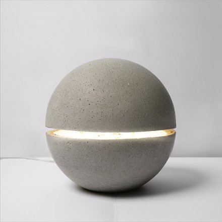
Studio Italia Blow
Flexa by Leucos

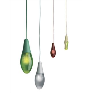
Luceplan Pod Lens Suspension Light

Torn Lights by Bill May


Educational Design: Kindergarten in Rosales Del Canal

I love the bright colorful facade of this Kindergarten located in Zaragoza, Spain. 

Project | Kindergarten in Rosales Del Canal
Location | Zaragoza, Spain
Year | 2009  


"With a square ground plan, the truncated pyramid-shaped roofing of these spaces, completed with a skylight, responds both to the primary identification with the protective roof of the house and to the advantages of height and additional lighting in the classrooms.  The general configuration responds to clearly organizational criteria, placing the classrooms around the patio, with service spaces situated between them and communicated on the inside with the corridor and on the outside with the patio, via a continuous exterior porch. The lobby, the multipurpose hall and an administrative area comprised of the reception. Modular and dry-joint systems were considered appropriate due to the need for the construction to be done in four months. "

Watch it grow from the ground up in this slide/video:


Elixir FIx: O+A Strategies & Architecture

O+A is based in Amsterdam on the former NDSM shipyard. It holds office in the front office of the Shipbuilding Warehouse with a spectacular view over the river IJ.
The studio is easily reached from Amsterdam Central Station using the free ferry service. The ferry leaves 15 minutes before and 15 minutes after each hour, taking approximately 15 minutes to get to the NDSM. A second ferry service leaves from the Houthavens with an irregular schedule. Please check the GVB's website for further details.
Should you come by car, parking spots are numerous and free of charge.
 Today's Elixir Fix is O+A Strategies & Architecture, based in Amsterdam. Founded by .  Auguste van Oppen and Marc van Asseldonk partnered for a design in the Eurpan 9 entry where they won first prize and wisely continued their partnership and opened O+A.  The awards and praises have not stopped coming.


Here are a few of my favorite projects from minds of O+A (built and conceptual).  Visit the links to read up on the full project descriptions.


Project | O+A's Studio, Their office is in a former Shipbuilding Warehouse!

Location | NSDM Shipyard, Amsterdam, The Netherlands 

awards
  • 2008: first prize Europan 9
  • 2007: nomination Archiprix 2007
exhibitions
  • 1/2010: 20 years Europan in The Netherlands, NAi Rotterdam (NL)
  • 9/2008: Europan exhibition, lecture and debate, Arcam Amsterdam (NL)
  • 5/2008: Europan 9 Forum of Results, Palacio de Congresos Santiago de Compostela (ES)
  • 4/2008: Europan 9 exhibition, NAi Rotterdam (NL)
  • 6/2007: Archiprix 2007 exhibition, Las Palmas Rotterdam (NL)
press
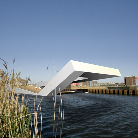
Project | Urban Beach
Location | The IJ Estuary, Amsterdam
Year | 2009
 

Location | Auyksciai Forest, Lithuania
Year | 2011
 

Location | De Gaffel, Veldhoven
Structural Engineer | Van De Laar  
Year | 2009  
Project | T Vaneker
Location | Municipality of Enschede

Year | 2009 

year: 2009
site: the IJ estuary, Amsterdam
commission type: unsolicited
team: Marc van Asseldonk, Auguste van Oppen

Aside from acquiring projects through traditional means, O+A is attempting to unfurl several initiatives of its own. One of these projects is the urban beach in Amsterdam’s IJ estaury.
O+A sees the city as a patchwork of meanings. On every corner of every street there is something which has a special value for one or more individuals, for one or more reasons. The history, the programme, the users, the events and of course the architecture together play a role in the realisation of this patchwork.
One of the most important issues in developing real estate is the marketing aspect. Developers spend enormous amounts of energy and money in marketing, in an attempt to create meaning for something which does not yet exist. Using billboards, websites and folders, images are portrayed with a predetermined image of happiness for a predetermined target audience. Through initiating the floating swimming pool in the IJ, O+A is attempting to create something which will allow potential users to form their own image of a site, in a more natural way. By combining public programme with a future building site, city dwellers are enabled to familiarise themselves with a site whilst being entertained. A developer is thus able to capitalise on an investment while making a significant addition to the amenities of Amsterdam.
The floating swimming pool is very interesting because it touches upon so many aspects of the city. The municipality of Amsterdam has initiated a major offensive concerning sustainability and it has great ambitions therein. One of the milestones in this endeavour is Amsterdam Waterstad (watercity) 2010. Several initiatives are being undertaken which should place Amsterdam on the map in terms of sustainability and water. In that light, the image of people swimming in the IJ would be a testament to the water quality in this city. Parallel to this discussion, national politicians are calling for more urban swimming locations. In short, the floating swimming pool has the potential to charm citizens, enterprises and governments alike.
For the design, a swimming pool has been taken with sufficient surrounding public space. This basic typology is folded to make the object more flexible. This way an open-air movie theatre can also be held in the summer and a wellness centre can also be held in the winter. The inclined surface presents itself as an urban beach which does no more than provide access to the IJ along Amsterdam’s rigid quaysides. The clear form in which all of this happens, works as a framework in which the variation of programme and users is encouraged.

Elixir Fix: Graft


GRAFT is a design studio that was founded in 1998 in LA by Lars Krückeberg, Wolfram Putz and Thomas Willemeit and two more offices in Berlin and Beijing.

The name GRAFT was derived from the terminology of botany, the grafting of one shoot onto another genetically different host. The practice believed that the traditional boundaries of architecture needed to be questioned, as it continually changes when it engages with global and local environments

Graft has received all kinds of accolades for their work, from residential to commercial to humanitarian, including Contract Magazine's 2010 Designers of the Year.

If you are looking for inspirational work, follow the jump, their website shows it best.

My Graft favorites are Loft Hamburg, W Hotel NY, KU64 Dental Spa ( I felt the sudden urge to travel to Berlin to for a cleaning after I saw the images of this AMAZING space), & KU65 Kids Club.

Trust me, it's worth the click: http://www.graftlab.com/

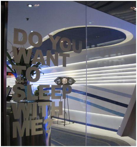
Project Crush: Room Mate Hotel-Barcelona

The Room Mate hotel motto is "Your friend in each city" and your experience is geared to make you feel as if you are staying with friends in town.  Most of the chain's hotels have a friendly moniker:  Leo, Lola, Oscar- and these friends are design savvy!!

The hotel brand boasts modern design at reasonable rates — averaging $100-150/night. The chain now has 15 hotels worldwide and the first Room Mate Hotel was the 56 room "Emma" in Barcelona. 

Check out the futuristic interiors by Madrid designer Tomás Alía, Façade by  Nadal Moneo.

I want to go to there!!


Elixir Fix : The Met Hotel


Project | The Met Hotel, a 212 room art hotel.
Location | Location: Thessaloniki, Greece
Architect Tasos Zeppos, Zeppos- Georgiades & Associates
Client | Chandris Hotel & Resorts

For a full narrative about the concept and design of Met Hotel visit this link.  Scroll to the bottom or visit this link to indulge in the video tour.


Modern Modular "Mobile" Home


Internationally famous designer Werner Aisslinger asked the question, "How could a temporary and simple accommodation, coping with the demands of a mobile society and its nomadic lifestyle, look like?"

In 2002, he answered his question by designing  Loftcube, a solid and mobile living unit guaranteeing high quality accommodation.
Exterior & Interior of  Loftcube
Aisslinger's idea of the Loftcube evolved into the Fincube, a multi-functional, energy efficient, sustainably designed, temporary Smart home.  Fincube is constructed of sustainable building products, uses innovative environmentally sound construction techniques, and has a low demand for energy. Fincube is designed as a temporary unit, ideal for both urban and rural areas, it can be dismantled and rebuilt on a new site.  It is so well thought out and designed, I would make it a permanent residence!


EXTERIOR DETAILS
The Fincube is built upon four height adjustable columns allowing it to adapt to any topographic condition.  The minimal foundation footprint keeps soil sealing and environmental impact on the project site to a minimum making it ideal for a temporary living unit. (Soil Sealing is the loss of soil resources due to the covering of land for housing, roads or other construction work.) Exterior building materials: European larch wood, Glass, steel foundation and mountings.

Only two square meters of space is required for the foundation.
The Fincube features a 360-degree glass facade.
Exterior wood slat cladding turns the Fincube into an architectural landmark, provides privacy and sun control.
ENERGY EFFICIENT AND SMART BUILDING SYSTEMS

The Fincube is heated with an energy efficient, high heat storage capacity from Austrian company Caladia. Caladia's innovative heating system is based on radiant heat which permeates the air and is nearly lossless; it generates heat only when hitting solid forms. The primary energy demand is under 130 kWh/m².

The Fincube is equipped with an intelligent bus system by Berker that connects all electrical devices via a control lead, allowing several devices can be controlled simultaneously.  The lighting, heating, motorized blinds and alarm systems can be operated with one control display. If you like, you can even call up the functions or status from your PC, iPhone or Palm. Moreover, you can teach your house to take care of itself in certain zones. By means of sensors it can detect good or bad weather, and can close the shutters all by itself if necessary. What this means is even when you are not at home you can be sure that your house is thinking like you- super smart!

Energy Efficient LED Lighting systems are used throughout. Fincube can also be upgraded by adding a green roof or a photovoltaic system to the flat roof. 

INTERIORS

Fincube is available in three interior packages.  Fincube without interior furnishings, Fincube with interior "standard", and Fincube with premium interiors. The furnished Fincube options feature interior furniture designed by Werner Aisslinger.  Interior material include Swiss stone pine wood furniture, ceramic tiling, Corian, and natural textiles.


This is not just a spec project, the Fincube is real! The Fincube show house is situated on Renon, South Tyrol and can be visited upon request personal guided tours through the Fincube.
The Fincube is currently available for purchase in Europe only (sad panda!).  Because of it's modular  wood construction, it can be ready for occupancy 70 days after production release.

Photo Credits
FINCUBE GmbH
Waltherplatz Nr. 8
I-39100 Bozen (BZ), Italy
VAT n.02696360219

Check out these other projects from Aisslinger and the Fincube team:

Recommended Dosage: StairPorn.org

Today, I thought I would share a bit of link love and something for you to add to your Interior Designer's Toolbox.

Staircases are often anything but sexy- unless you are cruising around the Stairporn website. Stair Porn™ is a weblog showcasing cool stairs from around the world. The stairs featured on this website are inspiring and lovingly detailed and arranged in easy to navigate categories, by style or material. Go visit the site and prepare to be inspired!

Here are a few of my fave stair designs from their site:

Helical Stairs


Creative Railings


Slide!


Cantilevered